Material
A paper-inspired surface gives the identity warmth without adding visual noise.
FICTIONAL CONCEPT · EDITORIAL IDENTITY
A visual identity and reading-rhythm study for an independent long-form publication concept. The work looks at how paper-like material, restrained colour and clear type can make room for careful reading.
← All selected studies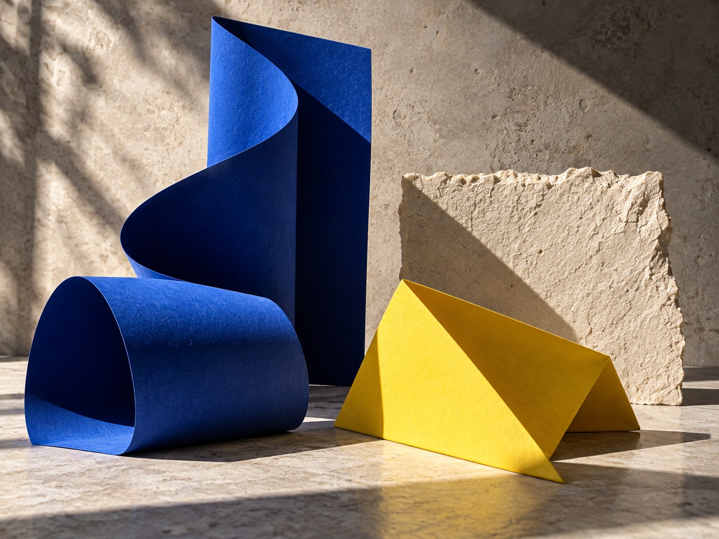
Long-form reading needs a steady pace. This concept pairs calm page structure with a distinct but limited palette, then uses typography to help readers move between the main story, supporting notes and related pieces.
A paper-inspired surface gives the identity warmth without adding visual noise.
A readable hierarchy distinguishes headlines, long copy and short editorial notes.
A small number of warm and cool tones supports navigation and emphasis.
Field Notes is a fictional concept, not commissioned work for a publisher or named client. The visual shows a direction for editorial identity and content structure.